CLIENT
RED BARN
PHOTOGRAPHY
PROJECT TYPE:
Brand Identity
DELIVERABLES:
✓ Logo Design
✓ Business Cards
✓ Custom Apparel
Introducing Kathrine Davy, the proud owner of Red Barn Photography, located in the beautiful Sacramento region. With five lovely children to nurture and a go-getter attitude, Kathrine has mastered the art of capturing breathtaking moments through her camera lens. She has a knack for real estate photography, but her passion extends to all genres. When she isn’t busy running her successful business, you’ll often find her tending to her ranch or taking care of her amazing kids. Wherever she goes, Kathrine’s creative spirit shines, always on the move and spreading joy.

INSPIRATION
TYPOGRAPHY
Katherine put a lot of thought into selecting the Weston font for her brand. It was the perfect choice that not only complimented her contemporary western style, but also blended seamlessly with her logo. This font stands out with its clean lines and creative appeal, capturing the true essence of Red Barn Photography.
WESTON
A B C D E F G H I J K L M N O P Q R S T U V W X Y Z
COLOR PALETTE
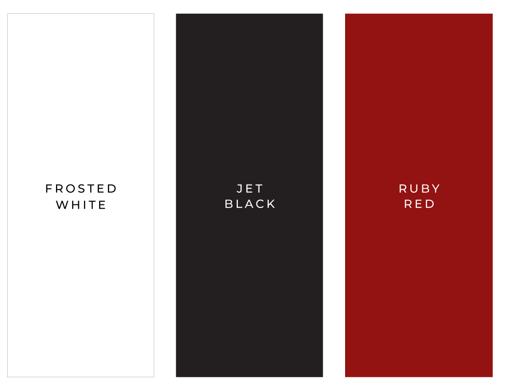
The color scheme for Red Barn Photography was intentionally chosen to ensure the brand stands out and is easily recognizable. It is important for a brand to have a distinctive visual identity, and Red Barn Photography achieves this by incorporating colors that are both eye-catching and memorable. The primary color used throughout the brand is red, which instantly comes to mind when one hears the name of the business. To further accentuate this color, additional colors such as white and black have been introduced to the overall design.
LOGO DESIGN
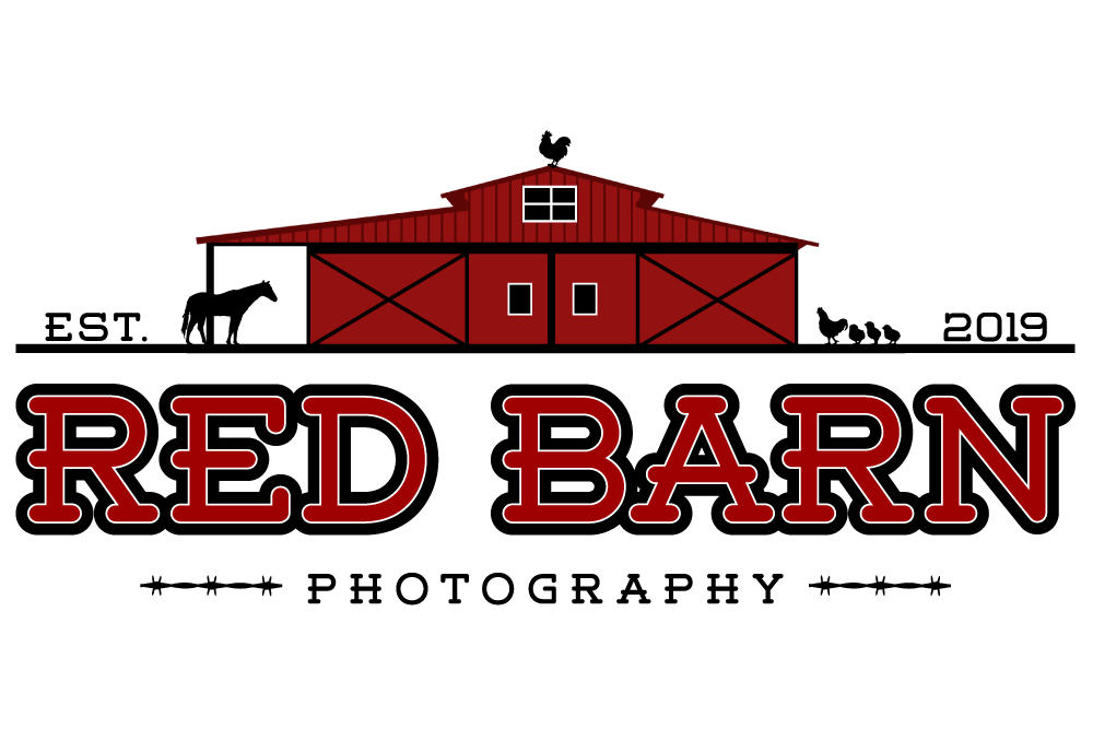
At the core of the Red Barn Photography logo is the celebration of family. The logo captures the essence of family bonds and the unconditional love that exists within it. The adorable baby chicks symbolize the precious little ones that bring joy and happiness to Katherine’s life. They reflect the innocence and playfulness of childhood. Meanwhile, the proud rooster represents Katherine’s loving husband, who stands tall and strong as a pillar of support and love. He represents the partnership and companionship that strengthens their family unit. For Katherine, family is the foundation of her drive, and they hold a special place in her heart. Their presence brings immense happiness and fulfillment to her life.
BUSINESS CARDS
Business cards are always in high demand because not only are they portable, but they also provide potential clients with easy access to contact information whenever needed. To keep things simple and visually appealing, I opted for a minimalist design in the layout. This approach not only attracts attention to the logo, but does so in a tasteful manner.

CUSTOM APPAREL
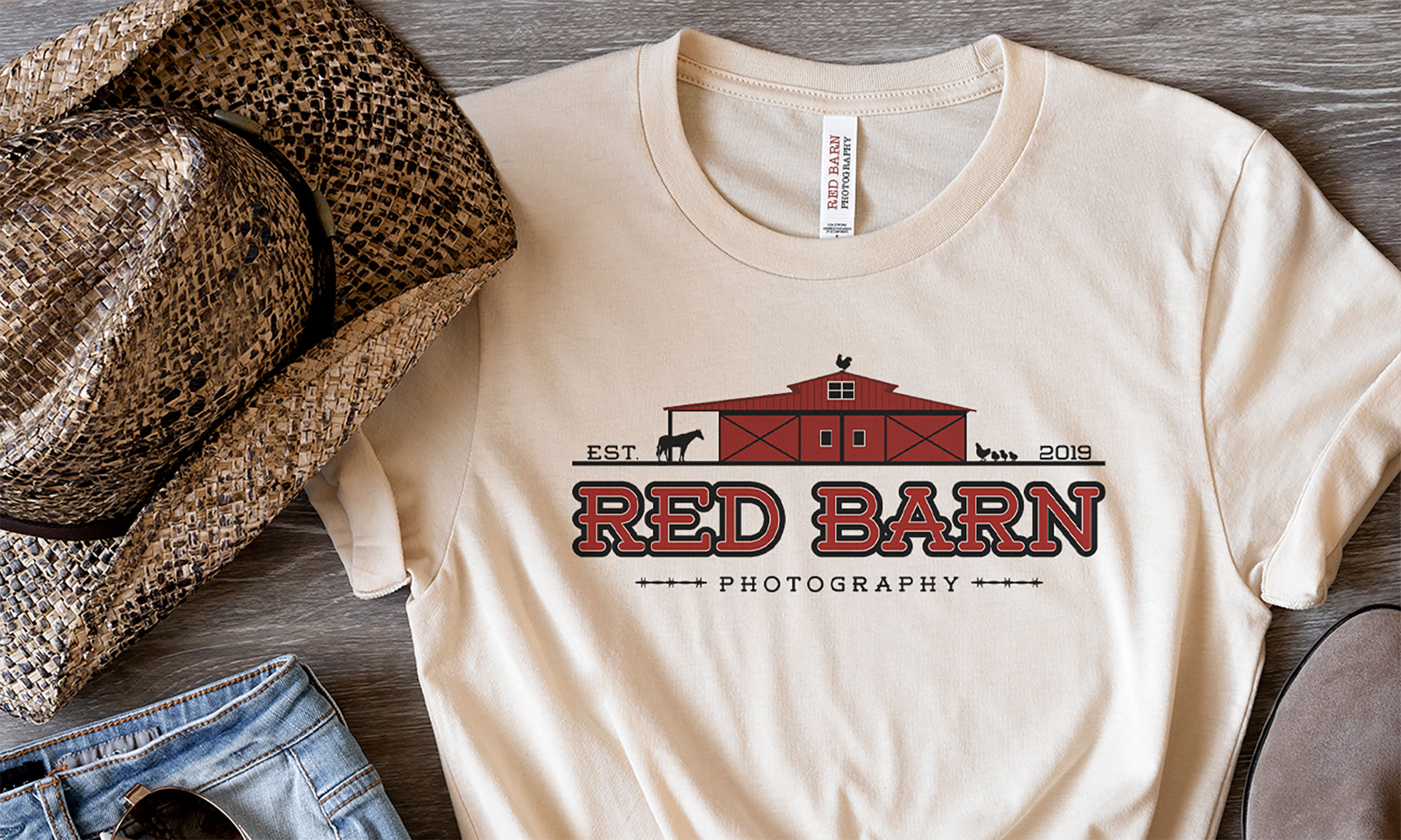
Katherine wanted to include a few custom-made t-shirts to wear during her photoshoots. She knew that having personalized shirts would not only make her brand more recognizable, would but also serve as a stylish marketing tool. The design she chose was simple yet effective – a clean logo on the tag and a more intricate one on the front of the shirt. Her custom tees were a perfect blend of professional and fashionable.
