CLIENT
BLIND TIGER
COCKTAILS &
PRIVATE EVENTS
PROJECT TYPE:
Print Production
DELIVERABLES:
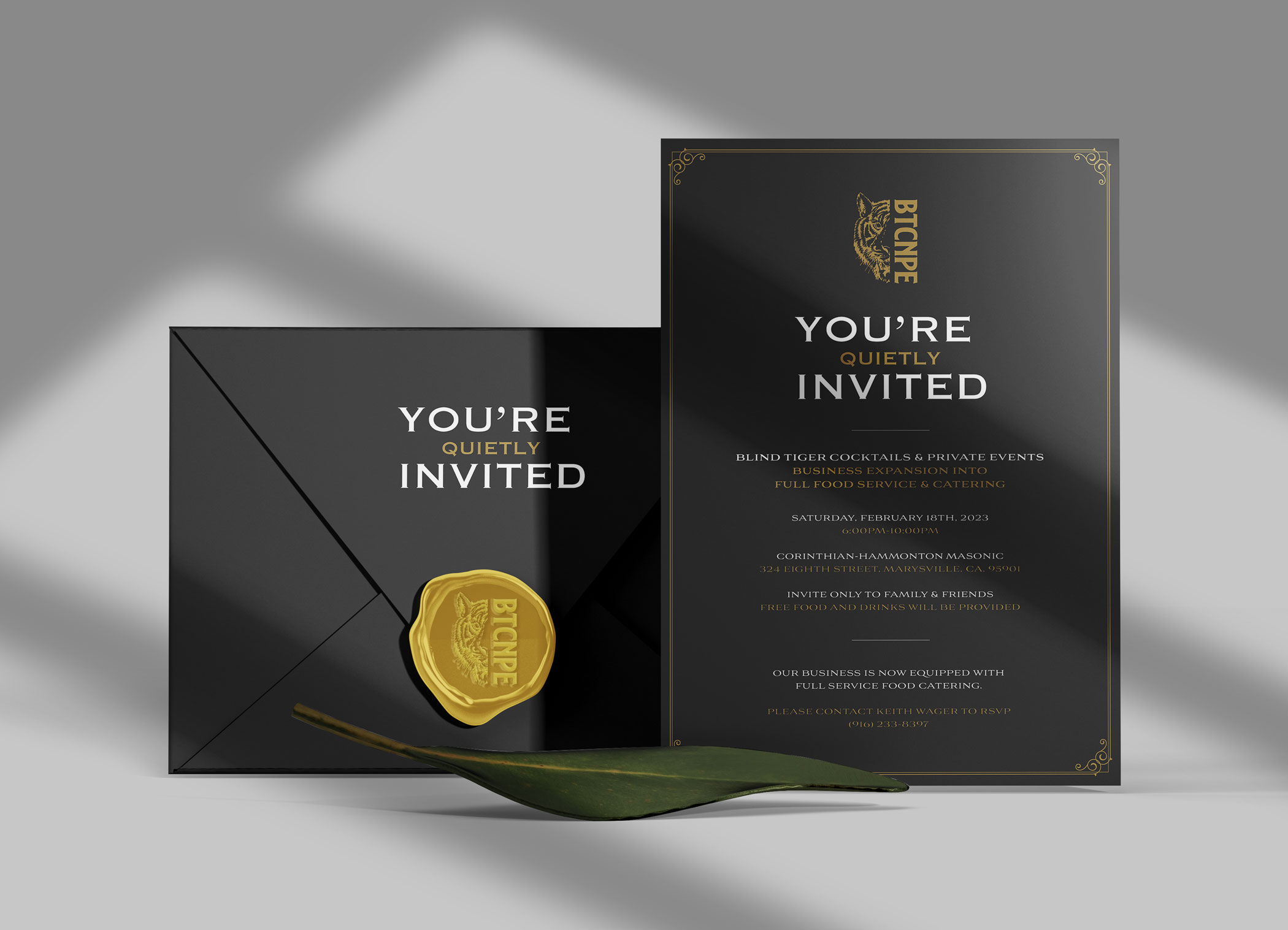
✓ Personal Invitations
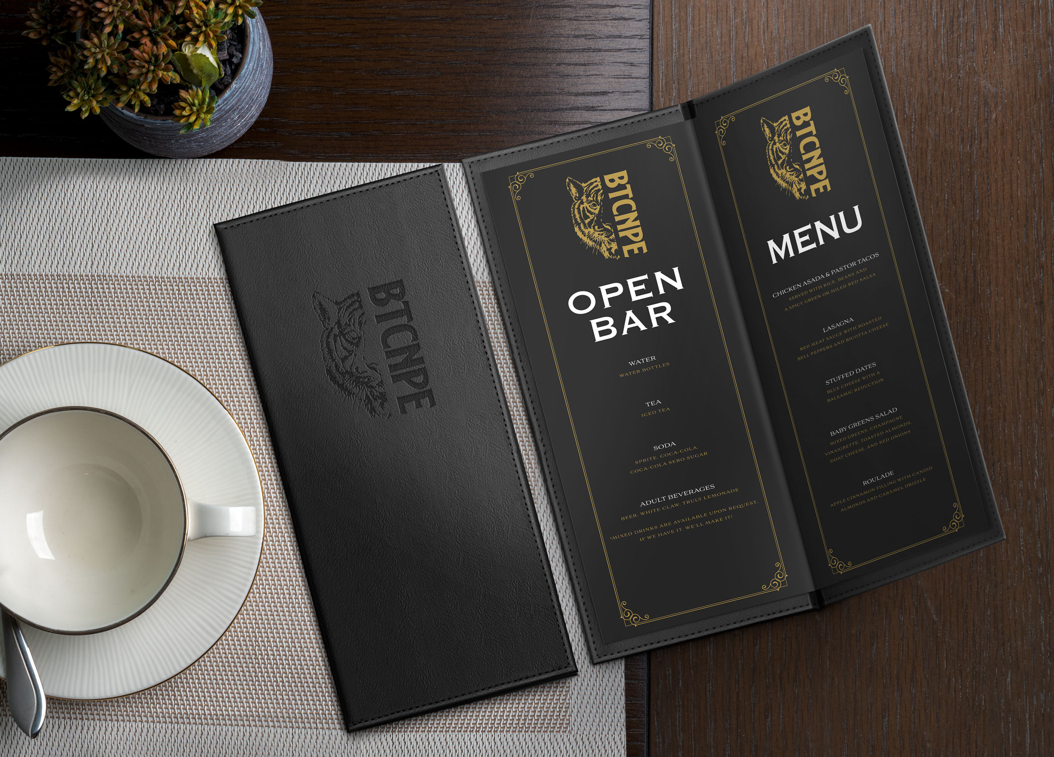
✓ Bar and Food Menus
✓ Full-Service Bartending Postcards
✓ Full-Service Food Catering Postcards
Blind Tiger Cocktails & Private Events, based out of Sacramento, California, is way more than just your average Bartending and Catering company. They take pride in going the extra mile to make their clients feel like VIPs and ensuring that every single special event they handle is an absolute success. Meet Keith Wager and Freddy Clemens, the passionate masterminds behind BTCNPE, who discovered their love for bartending during their early days working side by side. These two friends, now entrepreneurs are living their dream, making sure their client’s events are nothing short of amazing and unique.


INSPIRATION
The Blind Tiger brand embodies a perfect mix of masculinity and sophistication with a touch of speakeasy ambiance. In fact, the term “speakeasy” was often interchangeably known as “blind tiger” or “blind pig,” which is where the name originally came from. During the prohibition era, these vintage-style bars exuded class, pleasure, and elegance – similarly to how BTCNPE portrays itself.
TYPOGRAPHY
Choosing a typeface or a variety of typefaces can sometimes feel overwhelming, but in this situation, the decision was clear. Copperplate Gothic and Aviano were specifically chosen for their bold, sharp, and masculine qualities, which beautifully enhance BTCNPE’s brand and logo. Opting for a formal yet simple font for the secondary and body copy was the perfect choice for this specific series of projects.
COOPERPLATE GOTHIC
A B C D E F G H I J K L M N O P Q R S T U V W X Y Z
AVIANO
A B C D E F G H I J K L M N O P Q R S T U V W X Y Z

COLOR PALETTE
The brand guidelines of BTCNPE specified a color palette that included frosted white, jet black, and gold. Choosing a visual combination of black and white with a rich accent color not only created a strong message, but also acted as a clever strategy to attract attention to particular details of information within each individual deliverable.
PERSONAL INVITATIONS
Blind Tiger had something exciting in store – they were busy organizing a special event! This event aimed to broaden their horizons by venturing into food catering. It was a significant milestone for the owners, and they decided to keep it hush-hush by hosting a top-secret RSVP event. To maintain a classic and formal atmosphere, they decided to go for a straightforward design that provided essential details.

BAR AND FOOD MENUS
When the guests arrived at the special expansion event, they were greeted with custom menus that perfectly fit in stylish leather holders. The menus were not only designed to look upscale, but also added a modern and unique touch to the event. Many of the guests loved the menus and provided positive feedback—they were a massive hit!

FULL-SERVICE BARTENDING POSTCARDS
During the expansion event, guests were asked to write down their contact information which was then followed up a few weeks later with some postcards. One of the postcards featured Blind Tigers’ exceptional bartending and wait staff services. The layout emphasized two crucial aspects: the prominent word “Bartending” and a delightful image of Keith, the owner, skillfully preparing a refreshing drink. By highlighting these elements, we the purpose of the postcard was instantly clear!

FULL-SERVICE FOOD CATERING POSTCARDS
The second postcard highlighted the amazing food catering services offered by BTCNPE. The layout and details were just as impressive as before, but this time an irresistible snapshot of a mouthwatering taco dinner was included. The picture was so tempting, you could almost smell the tantalizing steam rising from it. As it pertains to design, it’s important to maintain simplicity and optimize the given space efficiently.


